01/11

建筑结构的本真之美

THE HONESTY OF STRUCTURE

Office for a Steel Conglomerate
Shanghai, 2020
Interior Design

Ornament is crime,” proclaimed Austrian Architect Adolf Loos in 1910. This provocative declaration not only heralded the onset of the modernism era in architectural history but also underscored the innate beauty of architectural space and materiality,  a sentiment that continues to reverberate today.

The Jiangsu Yonggang Group enlisted Slow Studio to revamp its office space. The original layout comprised six narrow rooms facing either north or south, each with low ceilings. The southern aspect provided excellent illumination with tall windows affording vistas of the city. Given this context, we opted to open up the space, delineating the original architectural framework with a spectrum of colours and maximising the utilisation of natural light. Through streamlining the arrangement, a spacious, luminous, and rhythmically attuned office environment was crafted.

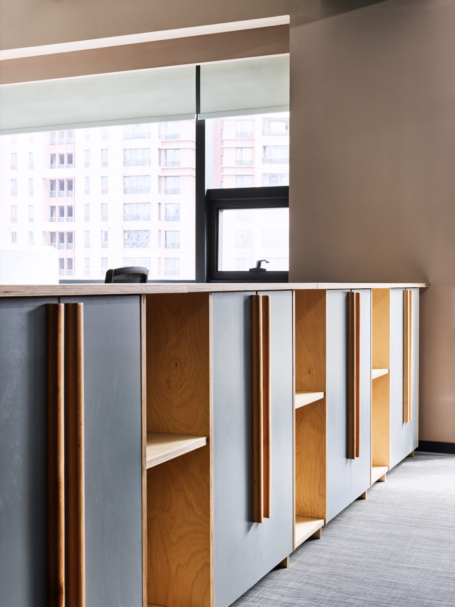
During the conceptual phase, Mr. Feng Jizhong’s “He Lou Xuan” served as a fount of inspiration. With its bamboo beams, thatched roofs, nestled amidst bamboo groves and waterside, it exudes the essence of the “Song Dynasty feeling” as articulated by Mr. Feng. In this design, black paint was employed to delineate all the nodes of the bamboo, imparting to each detail an individualistic and dignified character. Such a straightforward and unequivocal expression of structure not only evokes sentiment but also steers the course of this design endeavour.

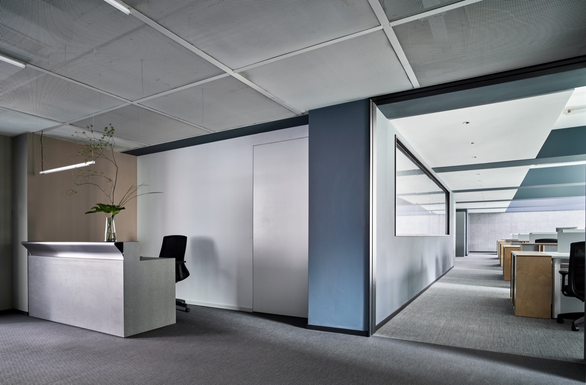
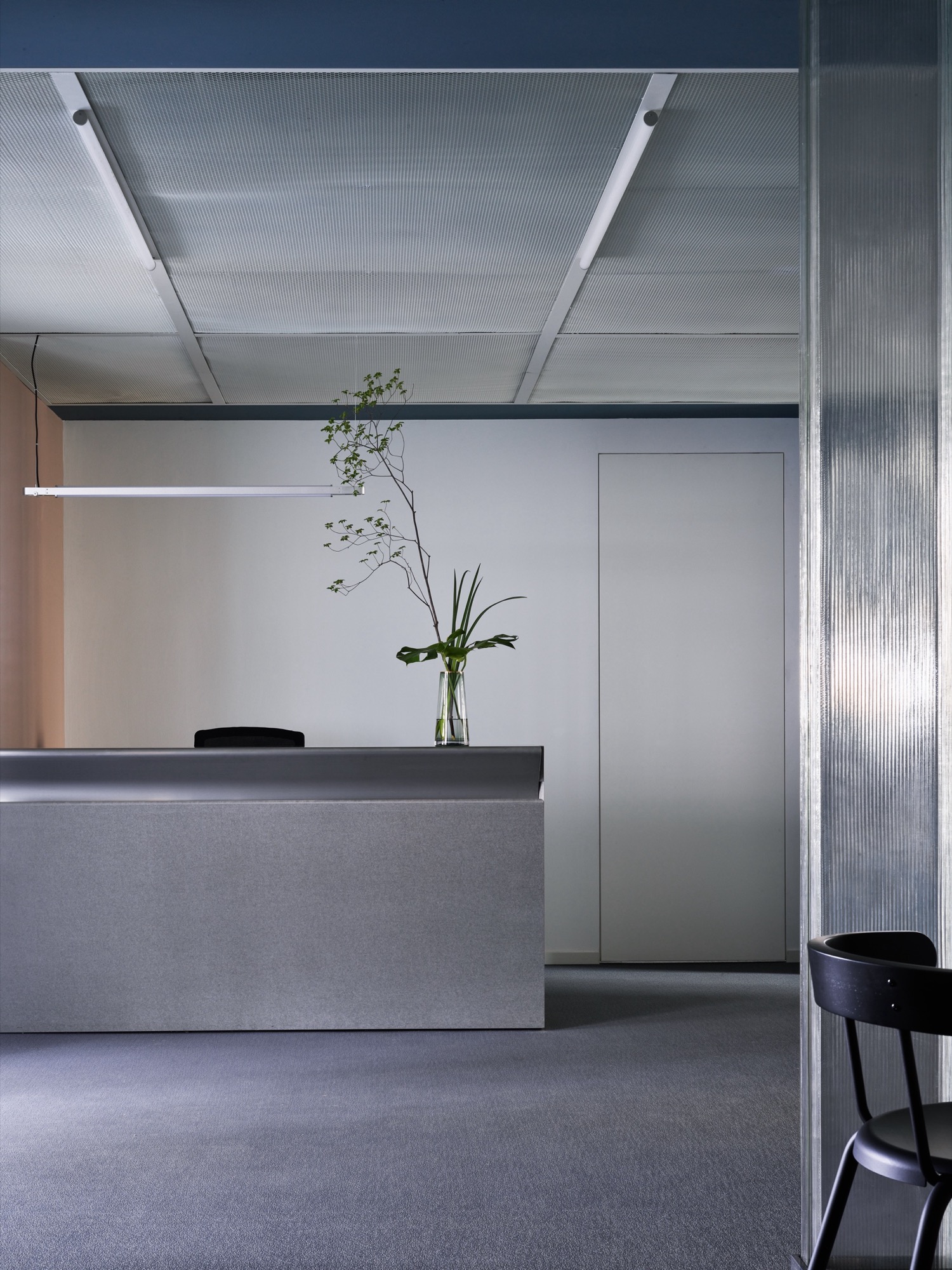
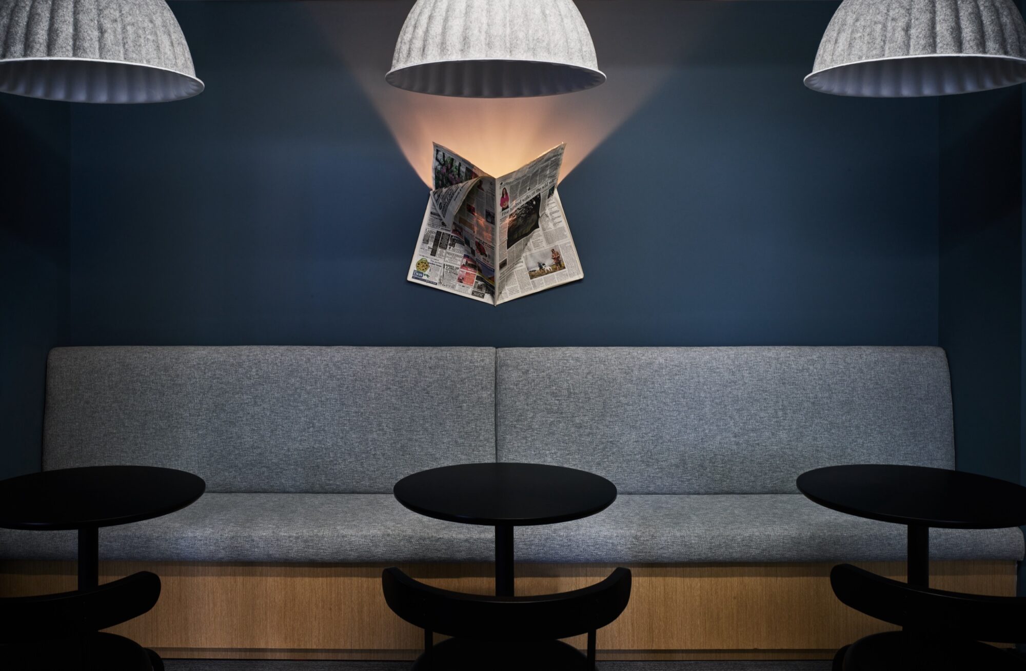
The office space begins with a compact reception area. Reflecting the client’s core business, stainless steel and metal perforated panels were selected for the materials. Opposite stands the pantry, divided by U-shaped glass, complemented by linear ceiling lighting and furniture accents, creating a pristine and refined atmosphere.

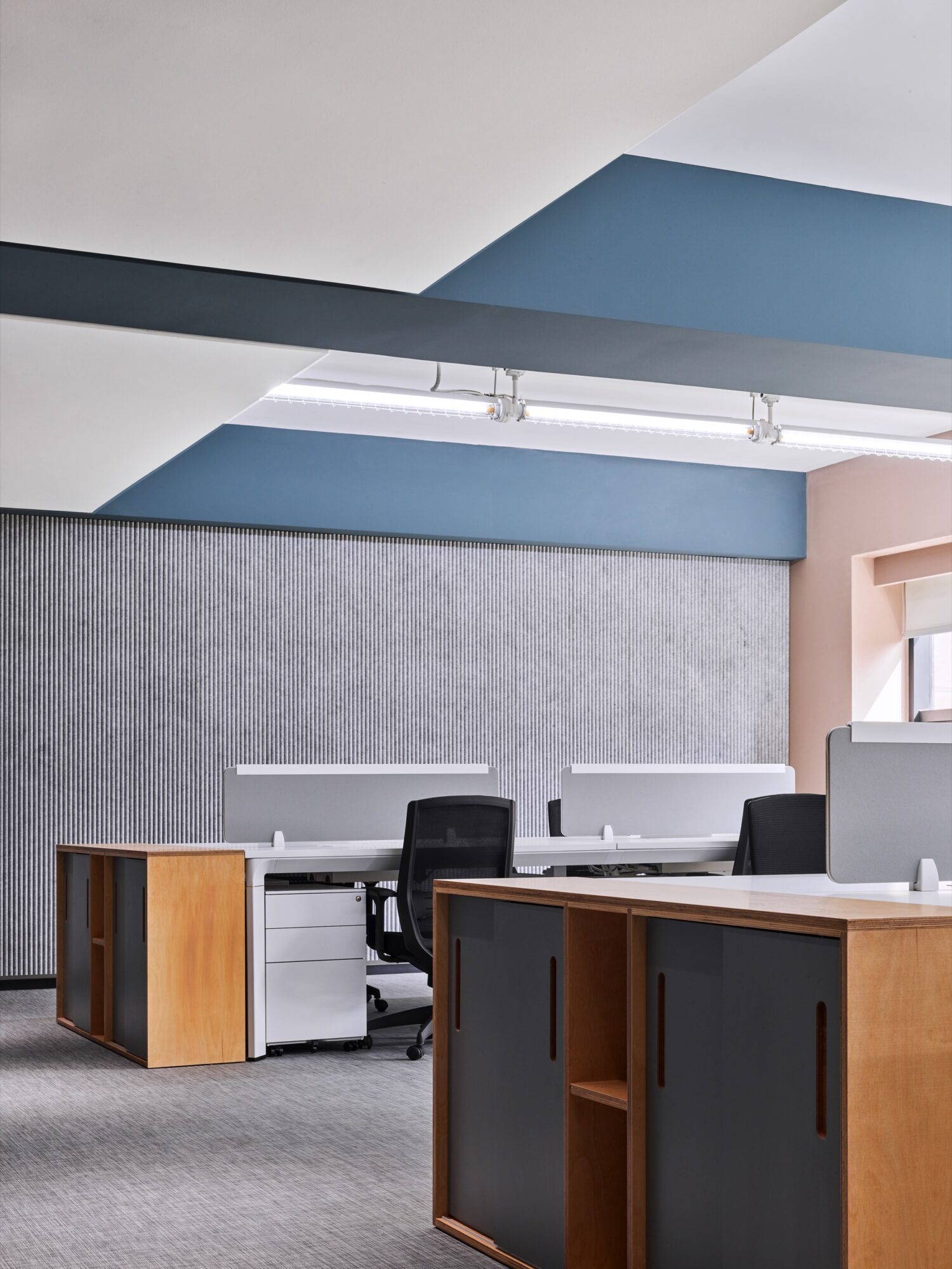
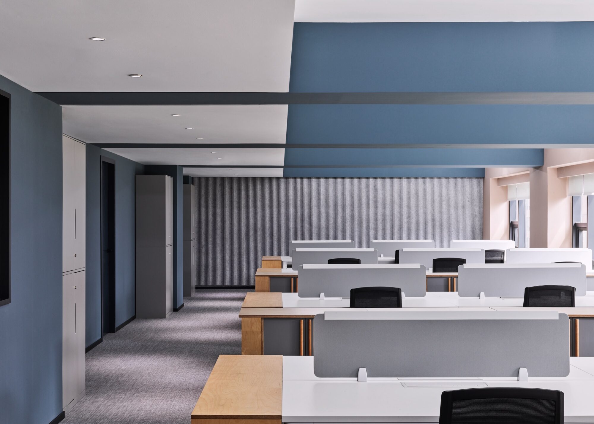
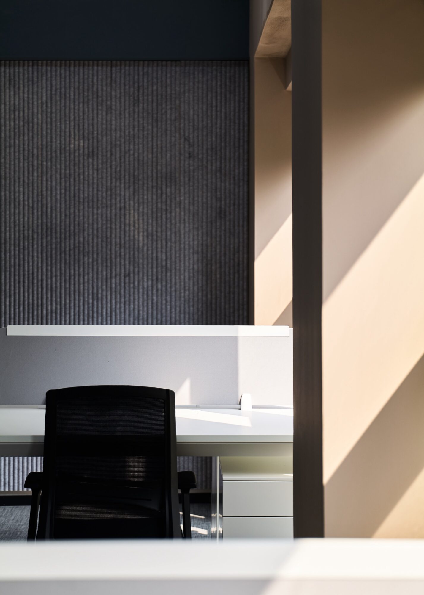
The open office area is the best showcase of our design intent. By exposing the original space’s architectural structure, we’ve accentuated its features. We’ve employed two colours to delineate the structural relationships: columns, beams, and the walls along one side of the columns are all in grey-blue, whilst the walls on the north and south sides are in beige. Ornate decoration has been eschewed in favour of a simple and lucid design language to highlight the spatial structure, showcasing its rhythmically rational beauty and inherent tension.

The unveiling of the original structure resolves the challenge of the relatively low ceiling height. Abundant natural light and linear lighting cascade through the well-organized space, imparting a sense of liveliness and fluidity. Grey carpets and felt finishes, alongside sleek and spacious furniture designs, allow employees to effortlessly immerse themselves in a pleasant, comfortable working environment, an energy cultivated by the space.

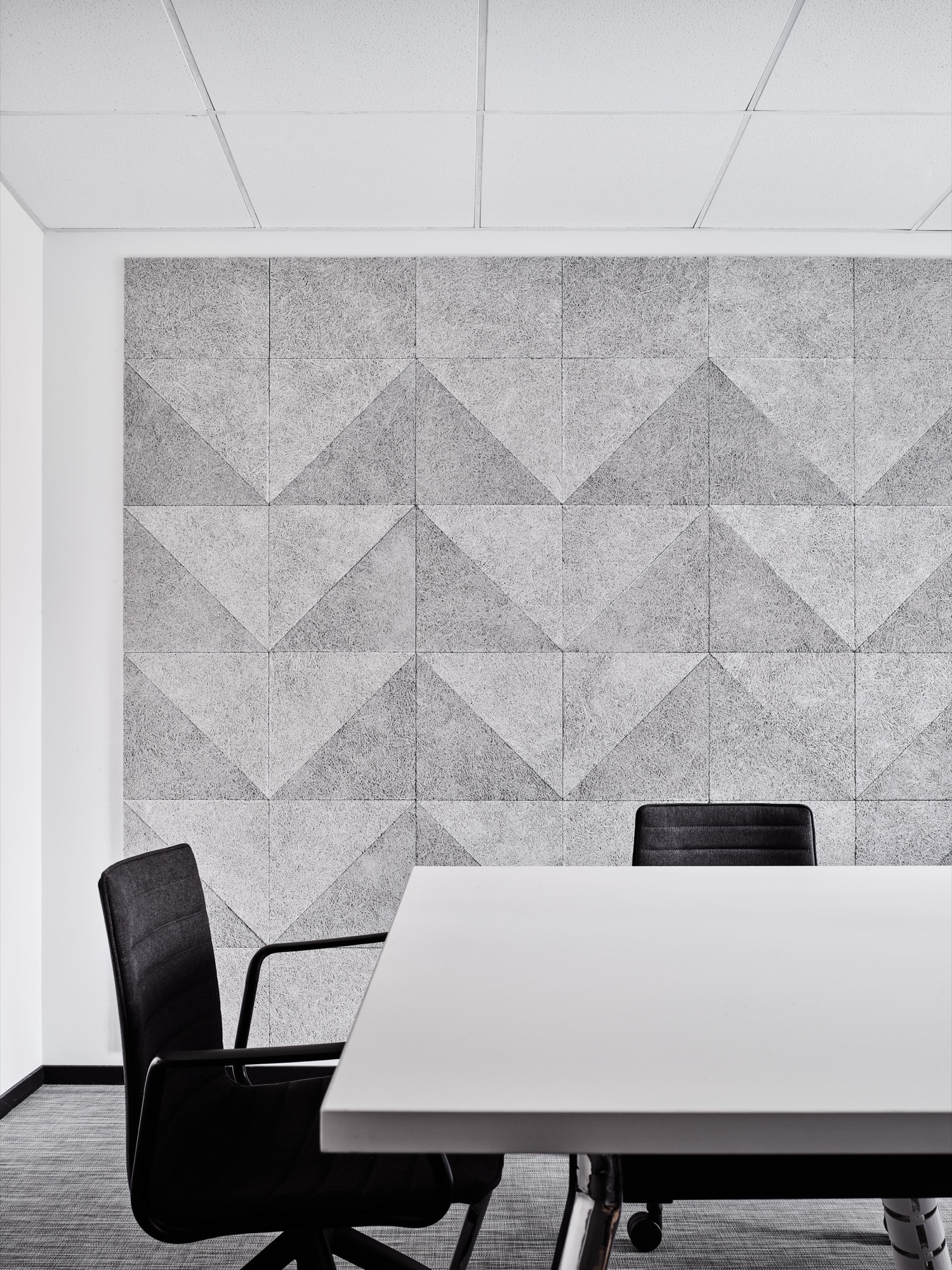
On the opposite side of the open office area lie individual work stations and meeting rooms. The meeting rooms feature walls crafted from light grey wood fiberboards arranged in a three-dimensional geometric pattern, enriching the spatial details while also providing sound-absorbing qualities.

The space’s aesthetic appeal derives from a clear, pure design ethos. Guided by this principle, we employs a lucid and direct narrative approach to showcase the genuine beauty of the architectural structure within this space, restrained yet ample.

Project Name Office in Dabaishu, Shanghai
Area 310 sqm
Architect Slow Studio
Construction Yue Sen Construction ltd
Email info@slowstudio.cn
Lead Designer Vincent Gu
Design Team Li Zixiong
Services Provided Interior Design, Construction, Site Inspection
Photographer Zhu Hai
Client Jiangsu Yonggang Group Co. Ltd